Breakthrough Broker Freemium
Landing Page & Paywall
UI Design | UX Design
Led the UX design for a key product shift on BreakthroughBroker.com, redesigning the landing page and introducing a new paywall experience to support the transition from a fully paid model to a freemium, tiered pricing structure. Focused on clearly communicating value, improving conversion, and reducing friction between free and paid offerings, using user behavior insights and iterative design to guide decisions. Delivered wireframes, prototypes, and final UI that aligned business goals with user needs, resulting in a more scalable and accessible product experience.
Landing Page Redesign
Final Design
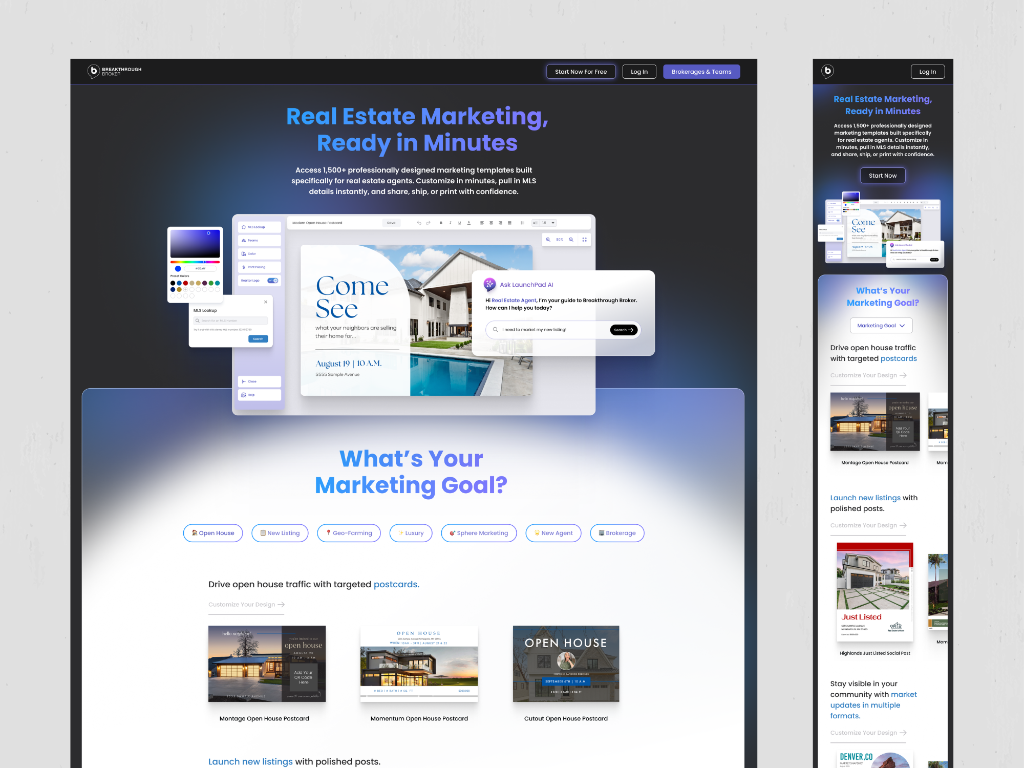
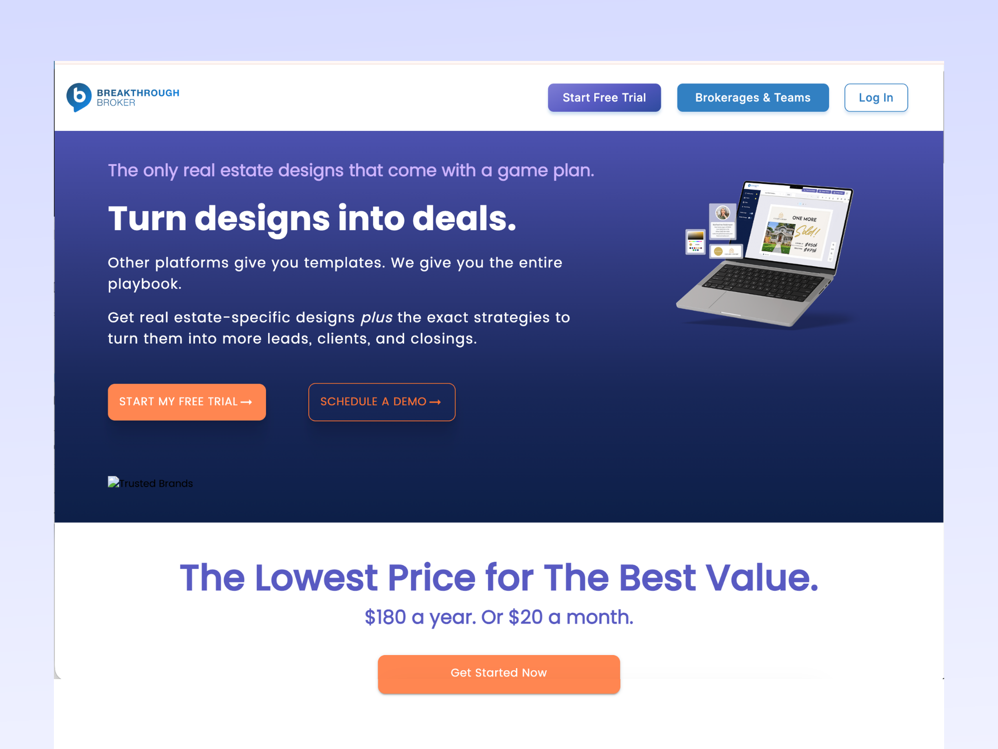
The main driver of the website redesign was to introduce the new pricing tiers and free trial. I took the opportunity to showcase the product UI so the user would understand what to expect with the SAAS product, as well as providing a better goals-based discovery flow.
While the original site included a lot of valuable information, the messaging, features, and calls-to-action were competing for attention, making it harder to quickly understand the product’s value.
My goal was to create a clearer, more engaging experience that guided users naturally through the story of the product. I reorganized the content to lead with a stronger value proposition, followed by goal-based browsing, customer proof, and clear opportunities to start a trial.
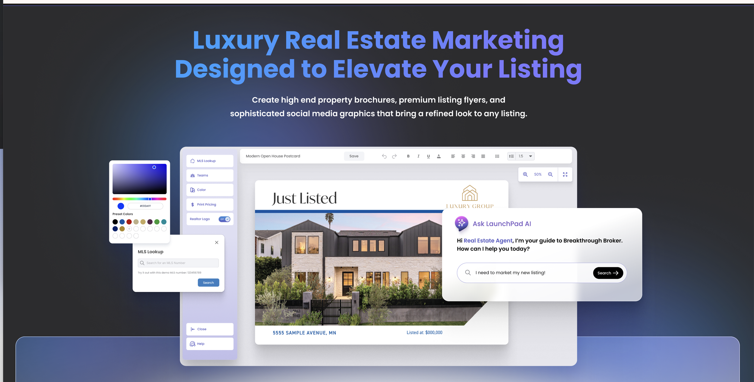
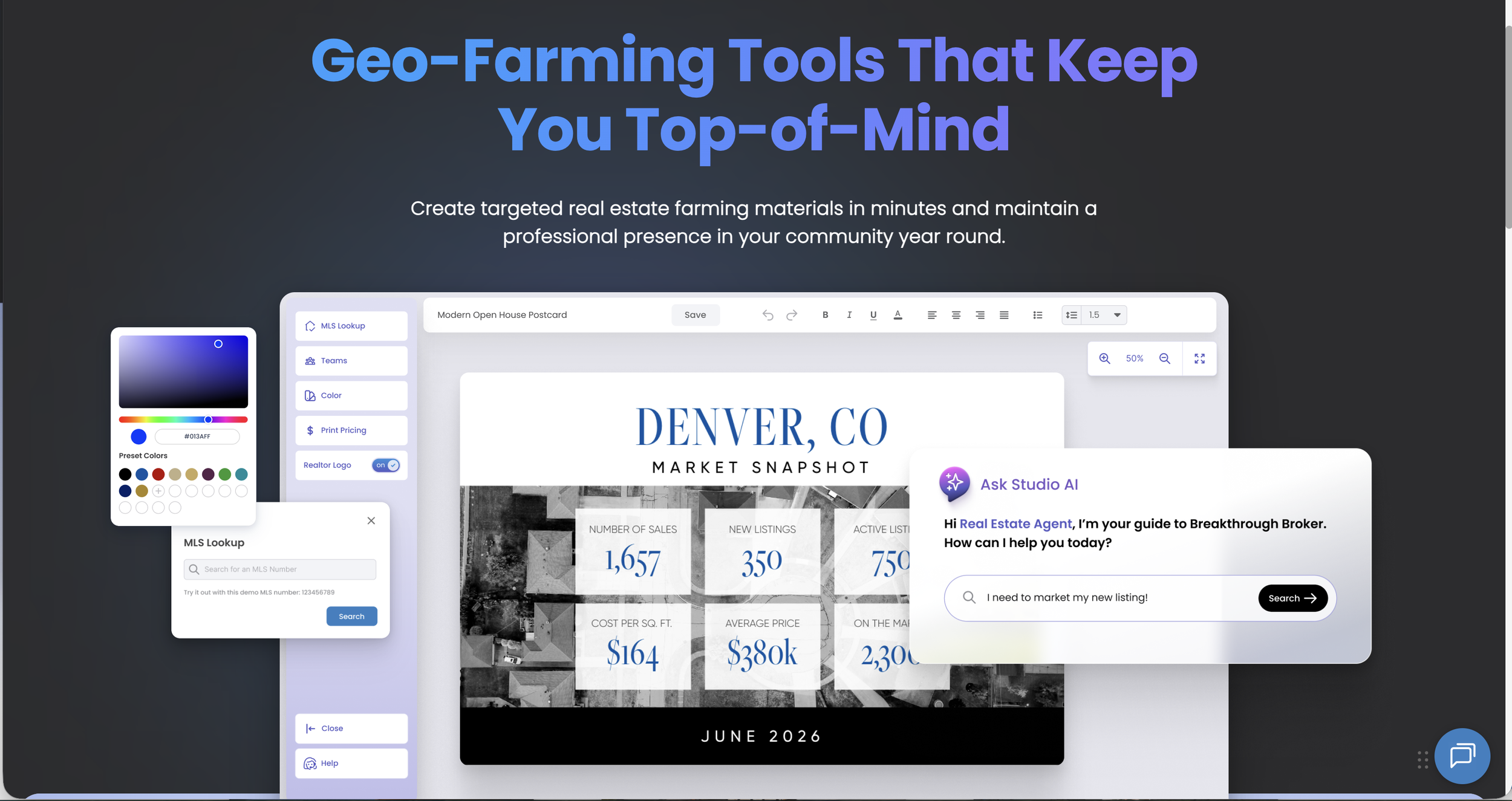
I also introduced a more immersive hero section, larger product previews, and cleaner content groupings to make the page feel easier to scan and more visually engaging. The updated design brings a more polished, modern feel to the brand while making it easier for users to understand what the platform offers, see themselves in the product, and take action with confidence.
Previous Design
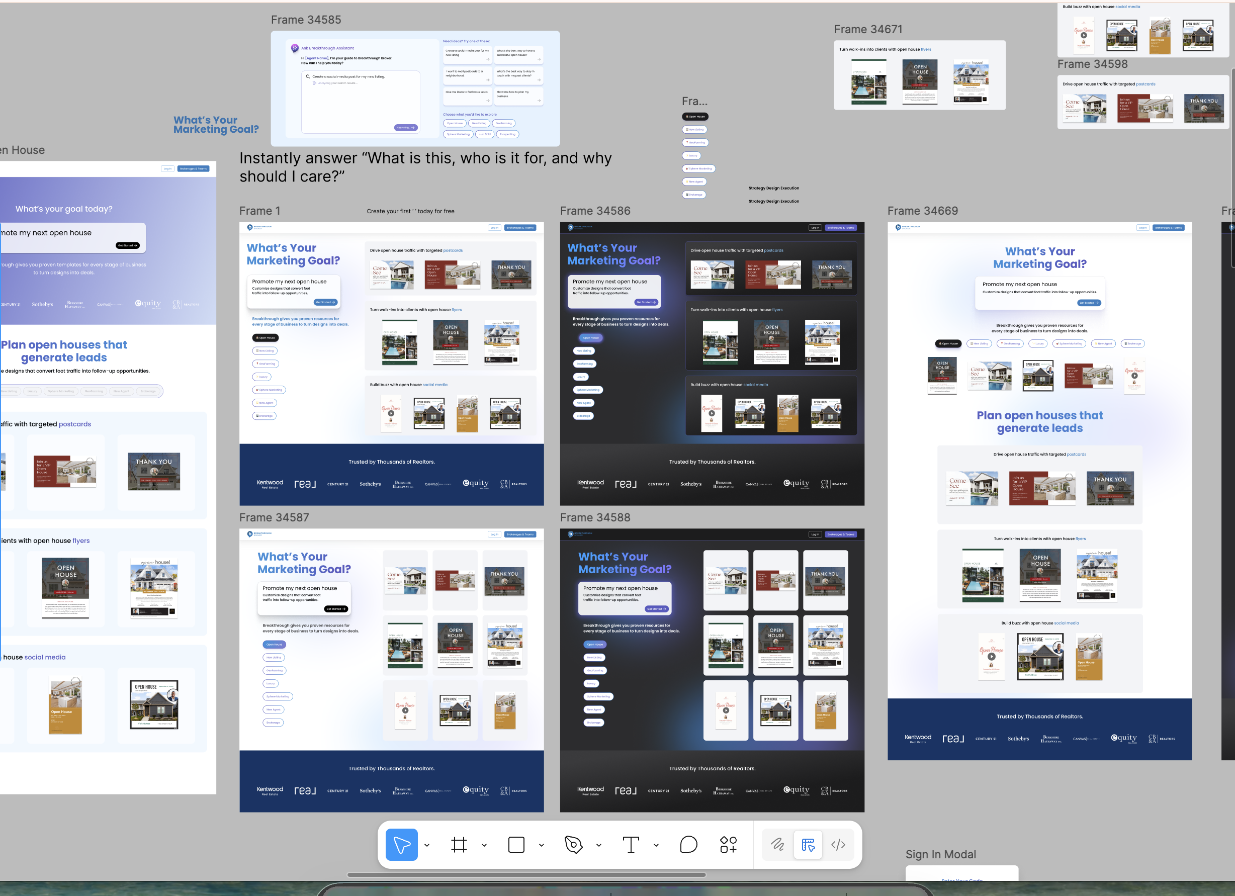
Design Explorations
I explored a variety of different design layouts - some showcasing elements of the product’s AI assisted search tool. I played with hierarchy and different ways to guide users by intent.
Prototyping
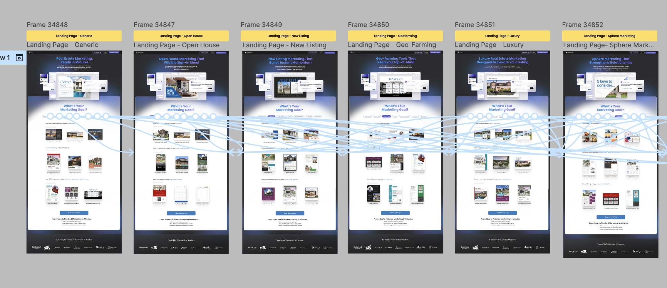
The vision for this landing page was to have the user view a different version depending on what targeted ad or marketing campaign they arrived from. The hero image, as well as the copy and content, will display information tailored to the user’s intended goal. The user may also switch between content for different goals with the “button” tabs. This UI design file was to be handed off to a new junior developer to vibe code, so I created a lite prototype to display the interactions.
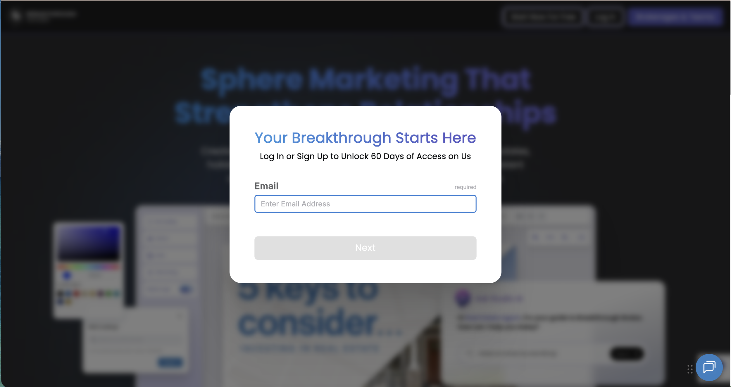
Sign In / Sign Up
We simplified the login/sign up flow to allow all users to sign up for a free, 60 day trial with only an email addess. The use gets a one-time login code, which logs them in automatically.