Title Agent Dashboard
UI Design | UX Design
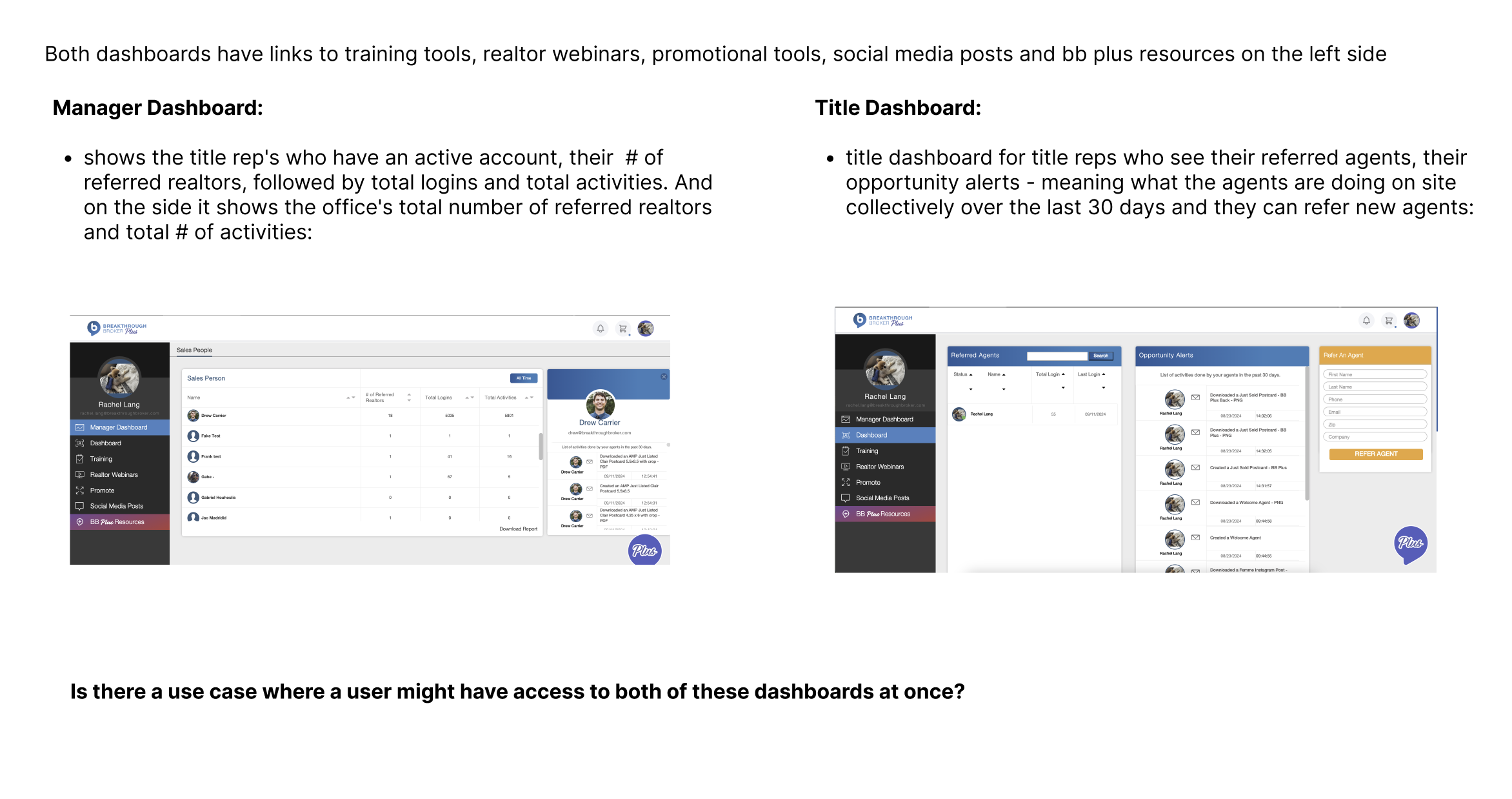
Breakthrough Broker, a real estate technology company, provides an internal dashboard as a service to Title Marketing Service clients. This dashboard allows the TMS agent to refer Real Estate agents to the product as well as track their stats and engage with them. The dashboard had a dated design, poor usability, and hidden features. As the Senior UX /UI designer, I worked with our account representatives and tech team to create a beautiful new design with enhanced usability and features.
Figma Prototype
Final Design
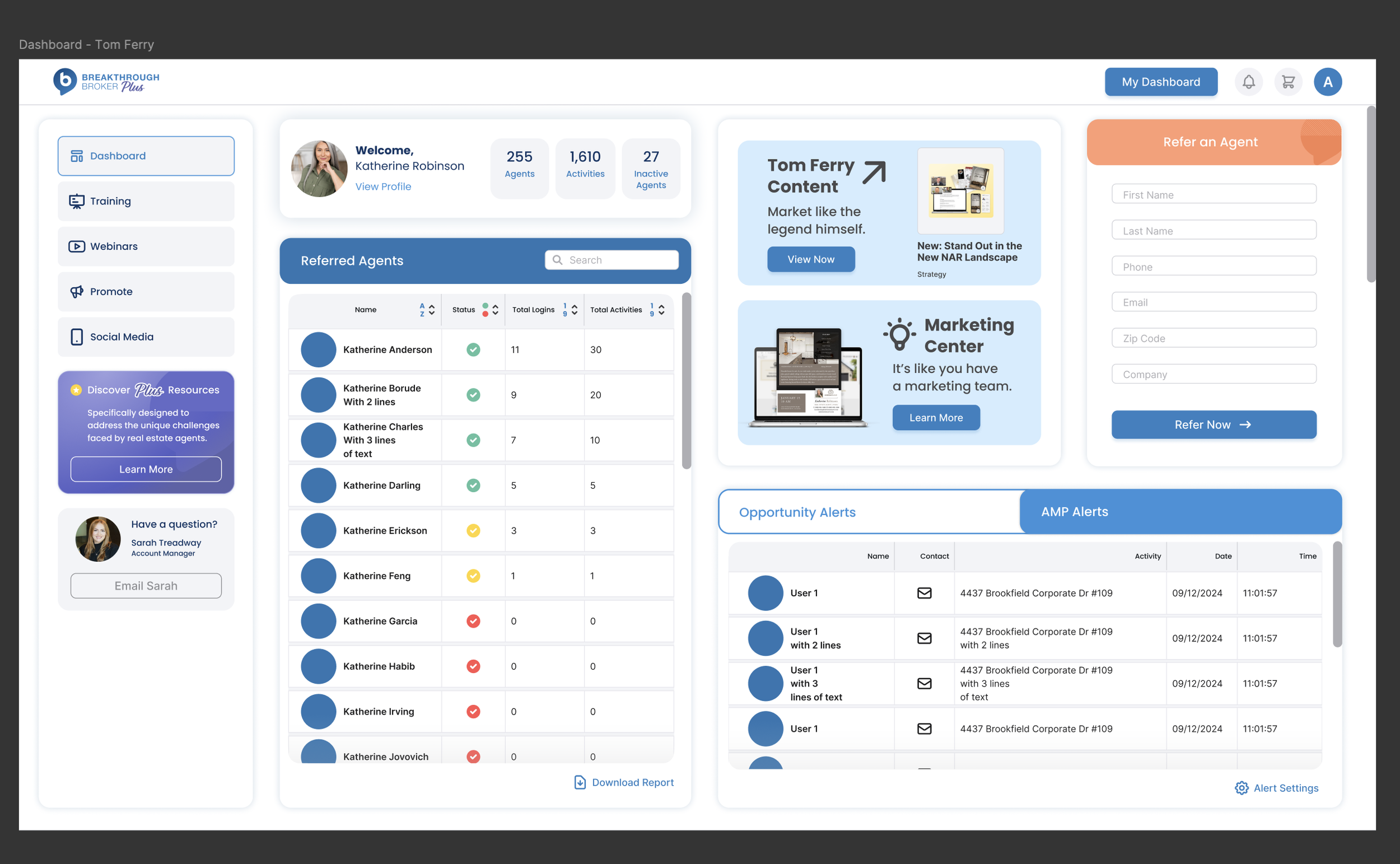
The final dashboard design looks clean and modern, and aligns with the current brand standards. I created a “bento box” style of cards to hold and display different content areas. This visually divides the different features and content into their own sections, making it easier for the user to locate. It also allows easy design updates if additional features are added - the boxes can be rearranged. A future update may include allowing users to customize dashboards by adding and rearranging the features they want.
Previous Design
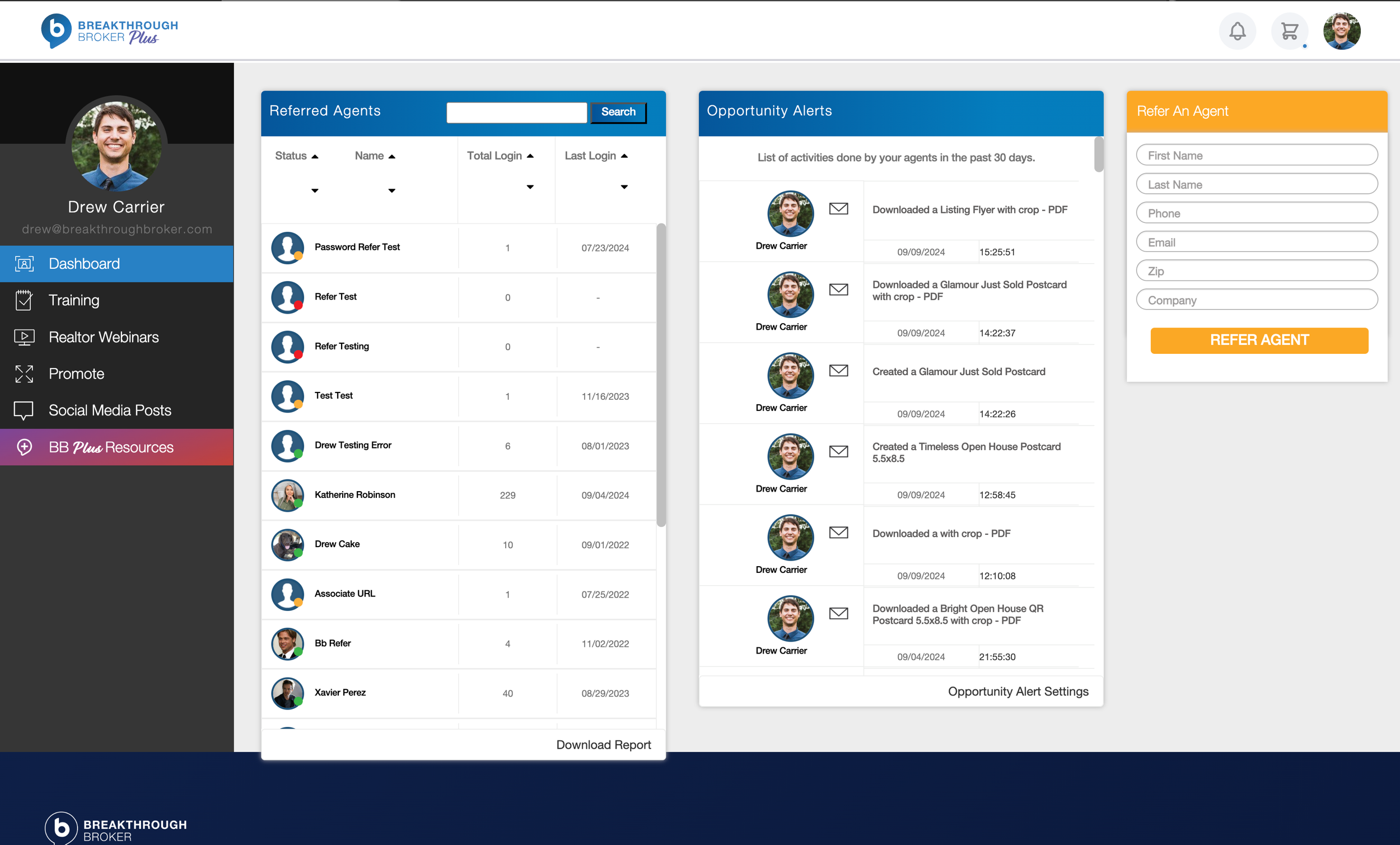
The previous design was outdated visually, and didn’t align with the current brand guidelines. Users frequently reported that they didn’t know what to do with the dashboard or where to find things. Certain features were hidden inside menus or required learning and memorizing where they were located - it wasn’t intuitive.
My Role:
UX & UI designer working with account managers, design director, stakeholders, and product team members to redesign the user dashboard.
Responsibilities:
Conducting research, creating wireframes & prototypes, meeting with stakeholders, creating high-fidelity designs in Figma, and supporting dev with implementation.
Research & Discovery
I met with the Account Managers for the TMS agents to gain their insights. They are responsible for training TMS agents on how to use the dashboard, as well as being the go-to resource for any additional product questions. This gives them a deep understanding of user needs and pain points. They had many opinions and had even created a helpful “wireframe” in Excel for me of the features they would like to see.
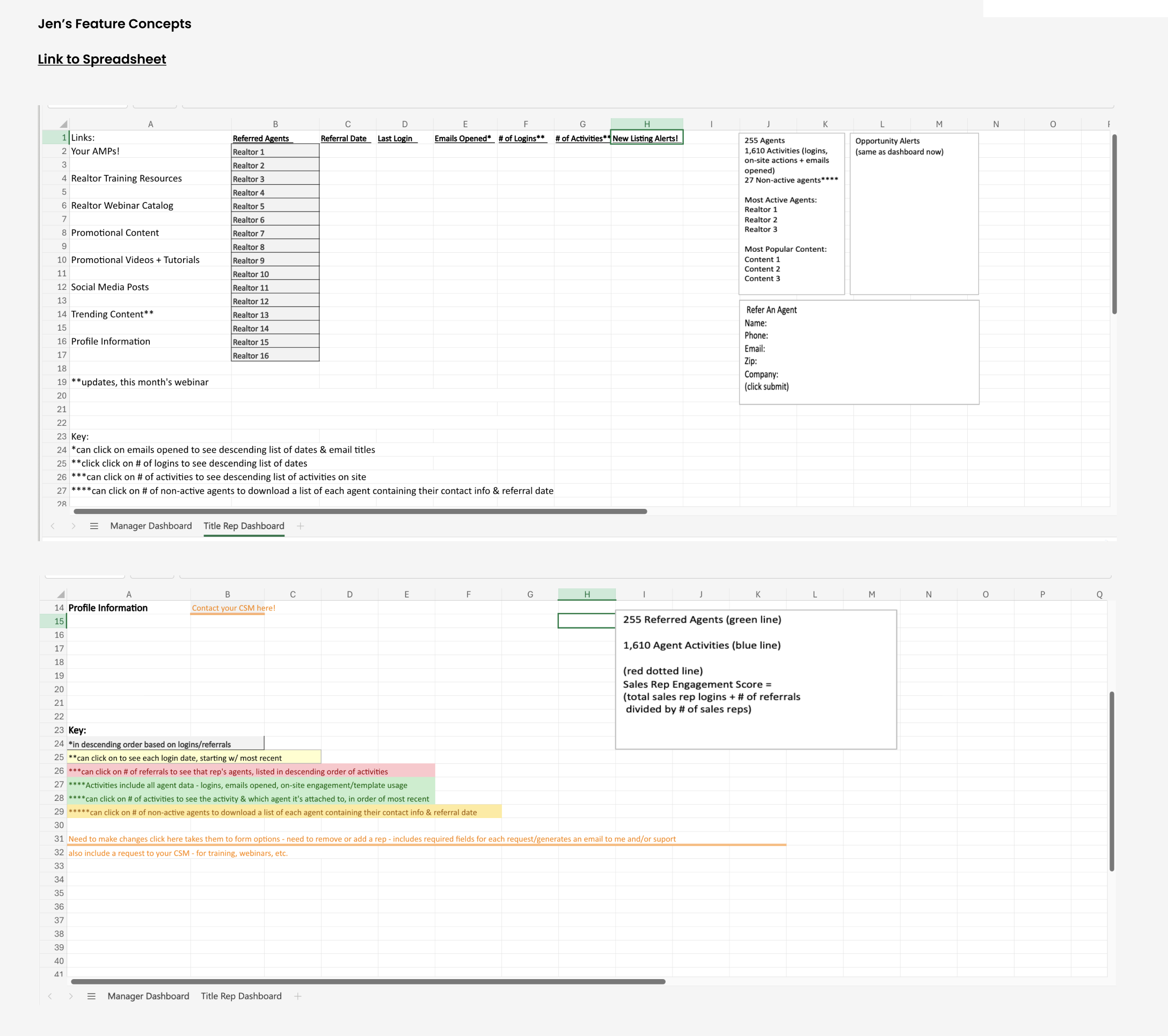
The title rep’s “wireframes”
This project had an additional layer of complexity, as there are 2 types of users for the dashboard. Each have some of the same features, but they also have some differences. As part of the discovery process, I created a Figma file with screenshots of the existing designs, as well as my notes and research. This allowed me to map out considerations for each version.
Wireframes & Lo-Fi Designs
Before creating high-fidelity designs, I experimented with different layouts for how the tools and sheets might be arranged. I also ideated a “floating” side navigation panel which visually blends as part of the “bento box” design. The main areas I needed to account for were:
Side navigation
Personalized “Welcome” message
Upgrade ad for our premium product
Refer an Agent modal
Different fields where the list of the TMS agent’s referred real estate agents and their activities could be seen and acted upon
Designs for additional sub-pages that house a variety of educational content and
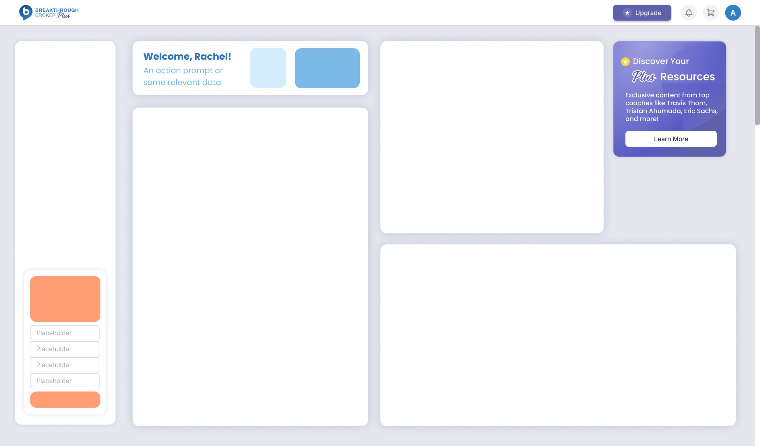
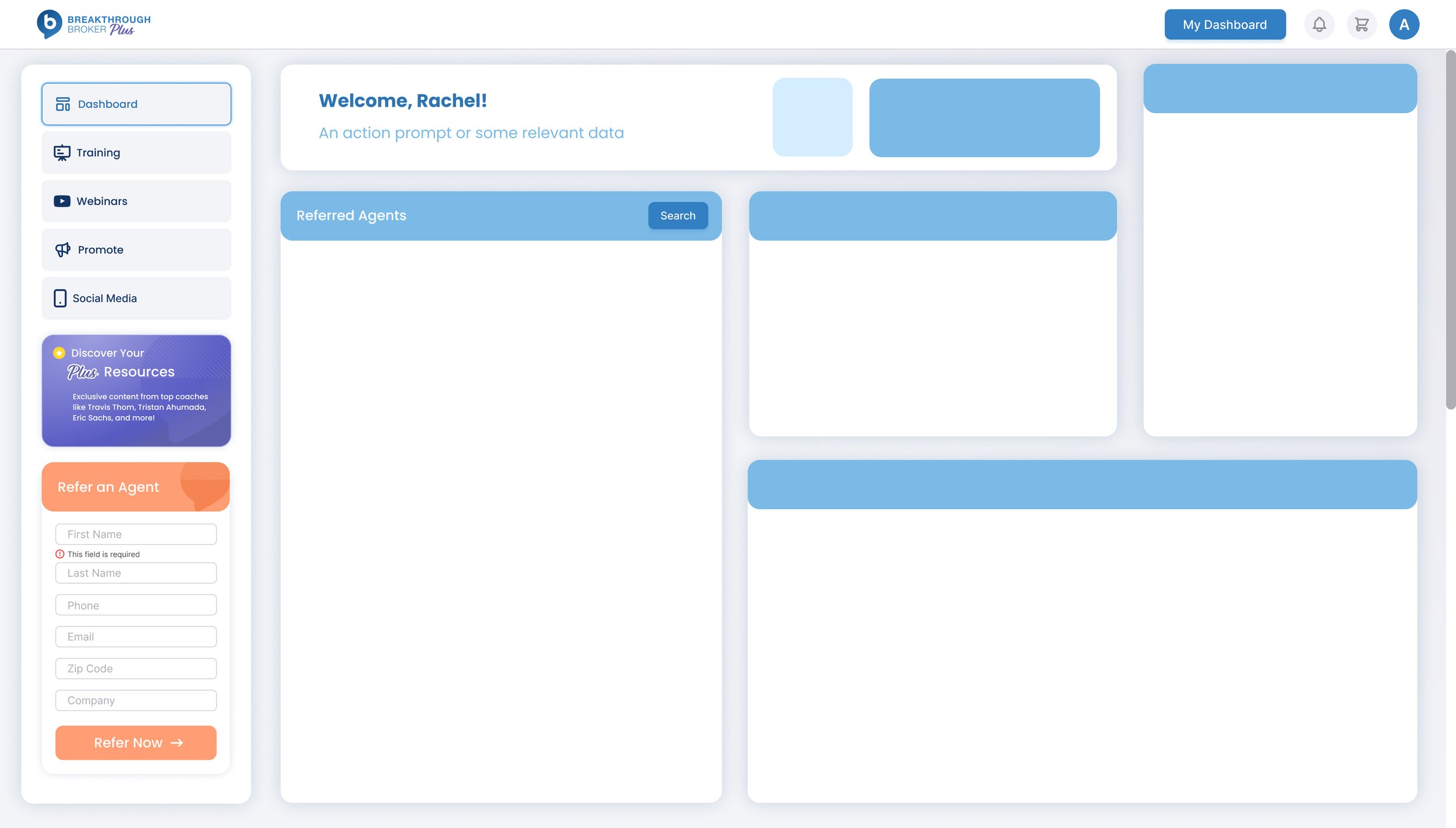
My initial concepts kept a darker, attached side navigation that was similar to the previous treatment - but my creative director asked me to push the design more and we landed on the floating navigation that won everyone’s hearts!
Final Designs
Creating with Components
Building the designs using components allows me to create functional prototypes, as well as easily switching between item states and features for different screens. It also allows me to make global changes if there are edit requests from stakeholders, without having to manually update every instance of each component.
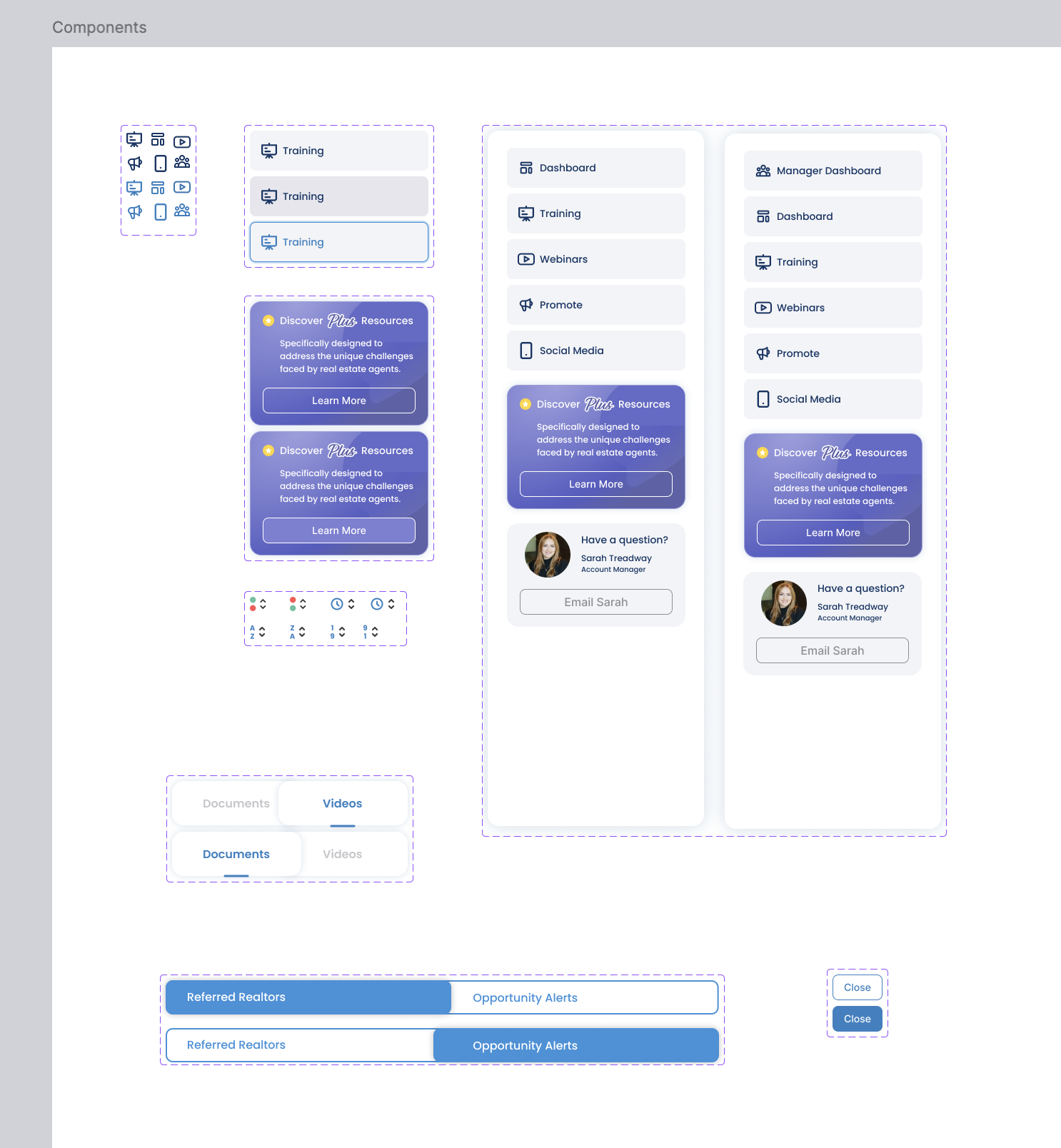
Various components make up the individual design elements.
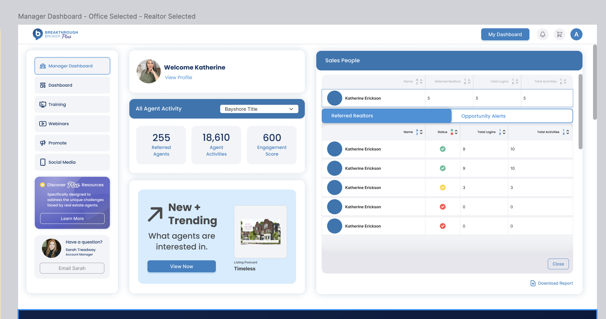
Final Design: Manager Dashboard
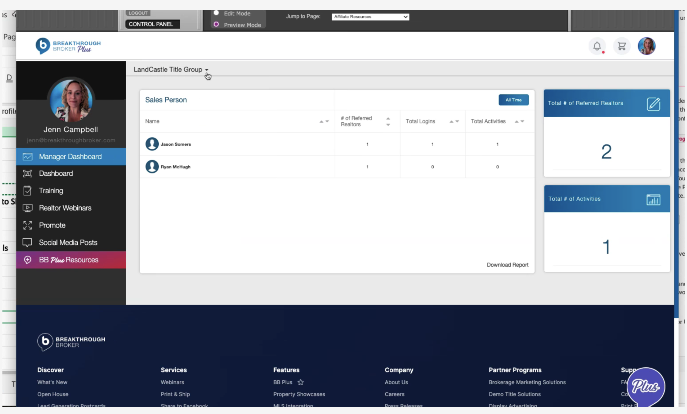
Previous Design: Manager Dashboard
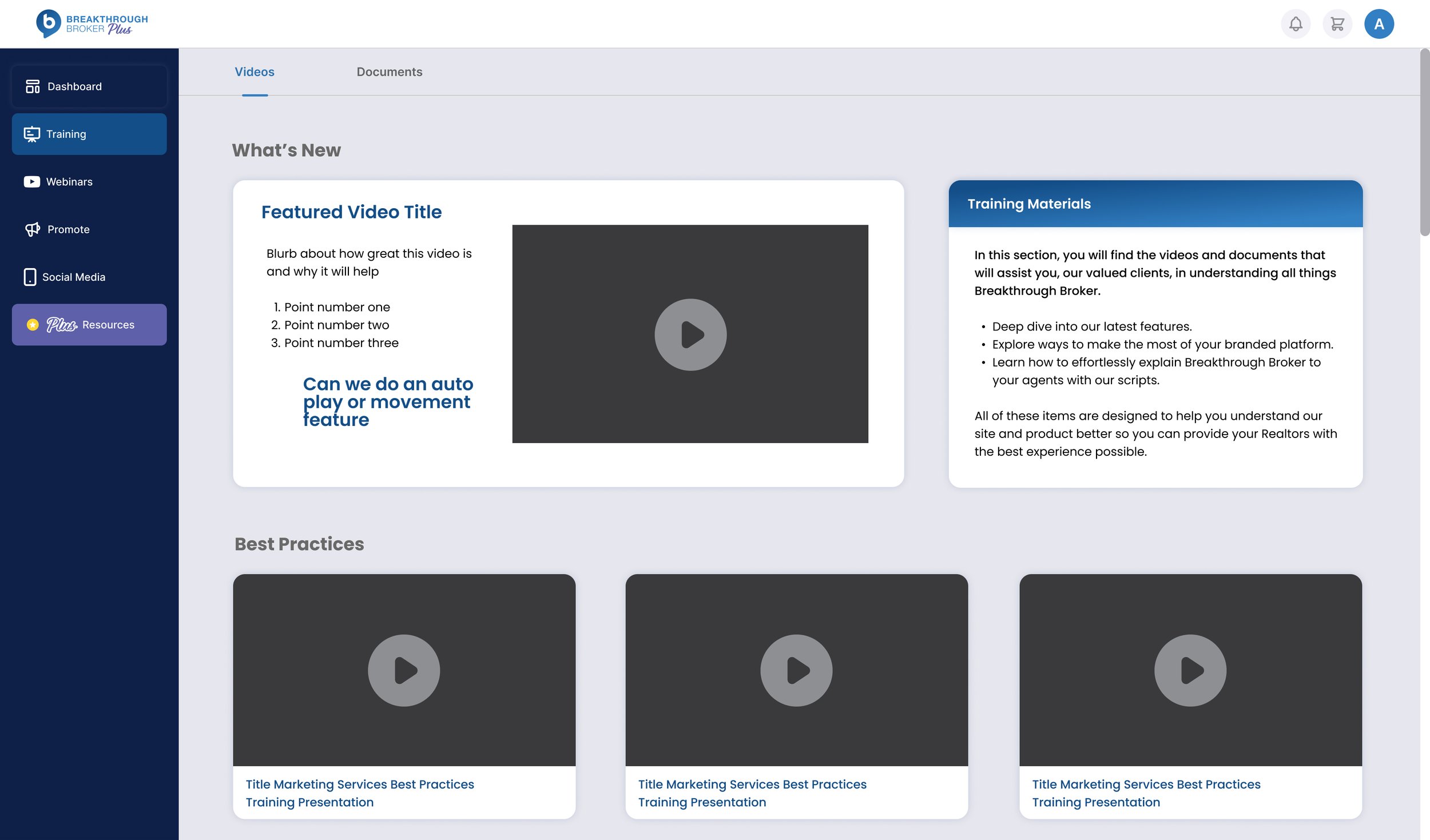
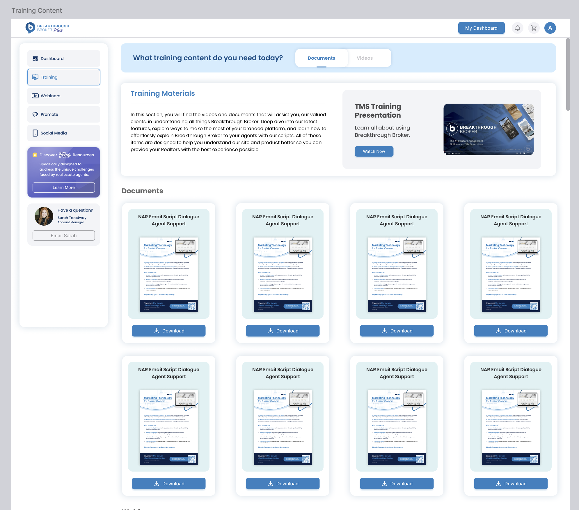
Final Design: Training Materials Page
Previous Design: Training Materials Page
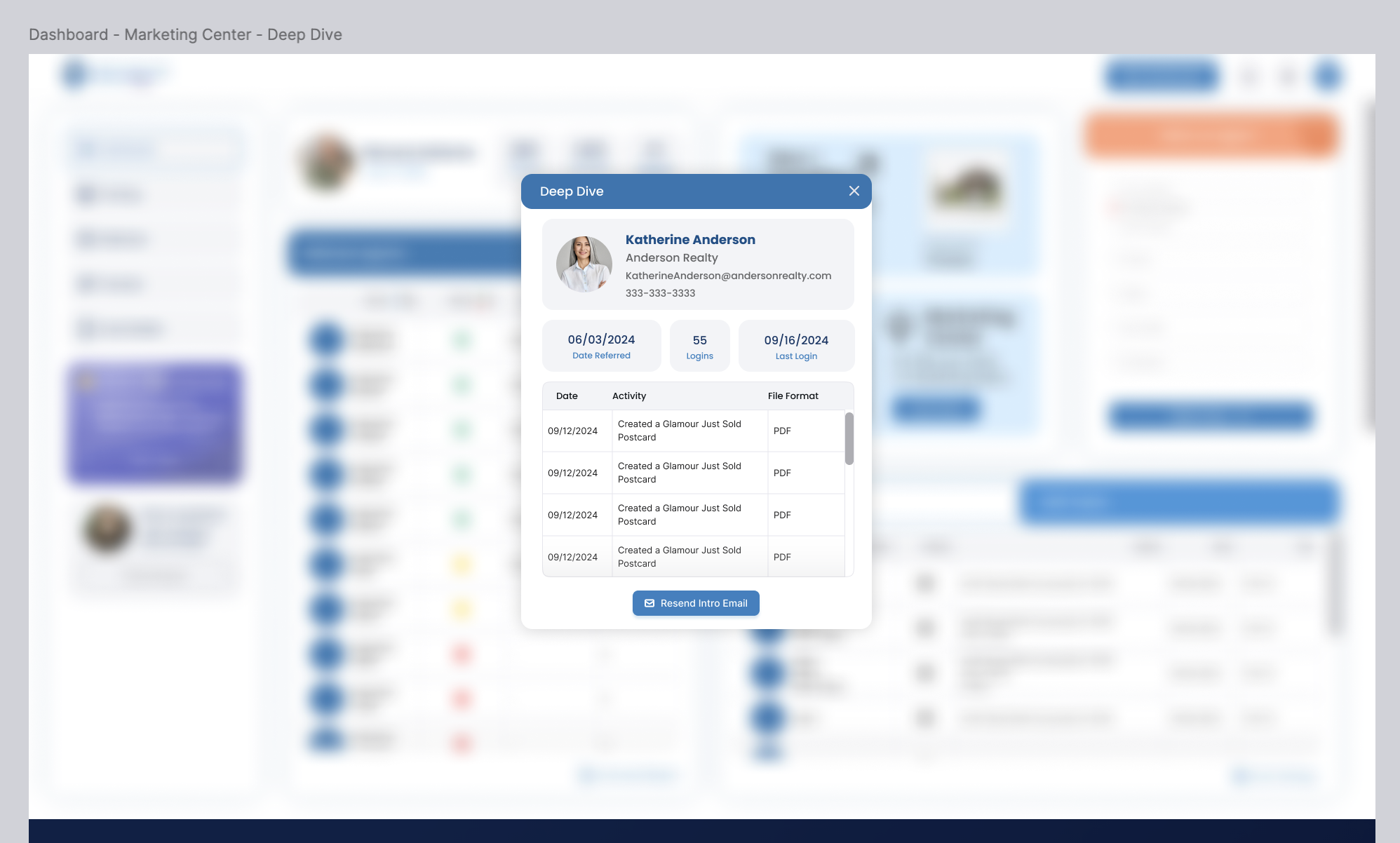
Final Design: Deep Dive Modal
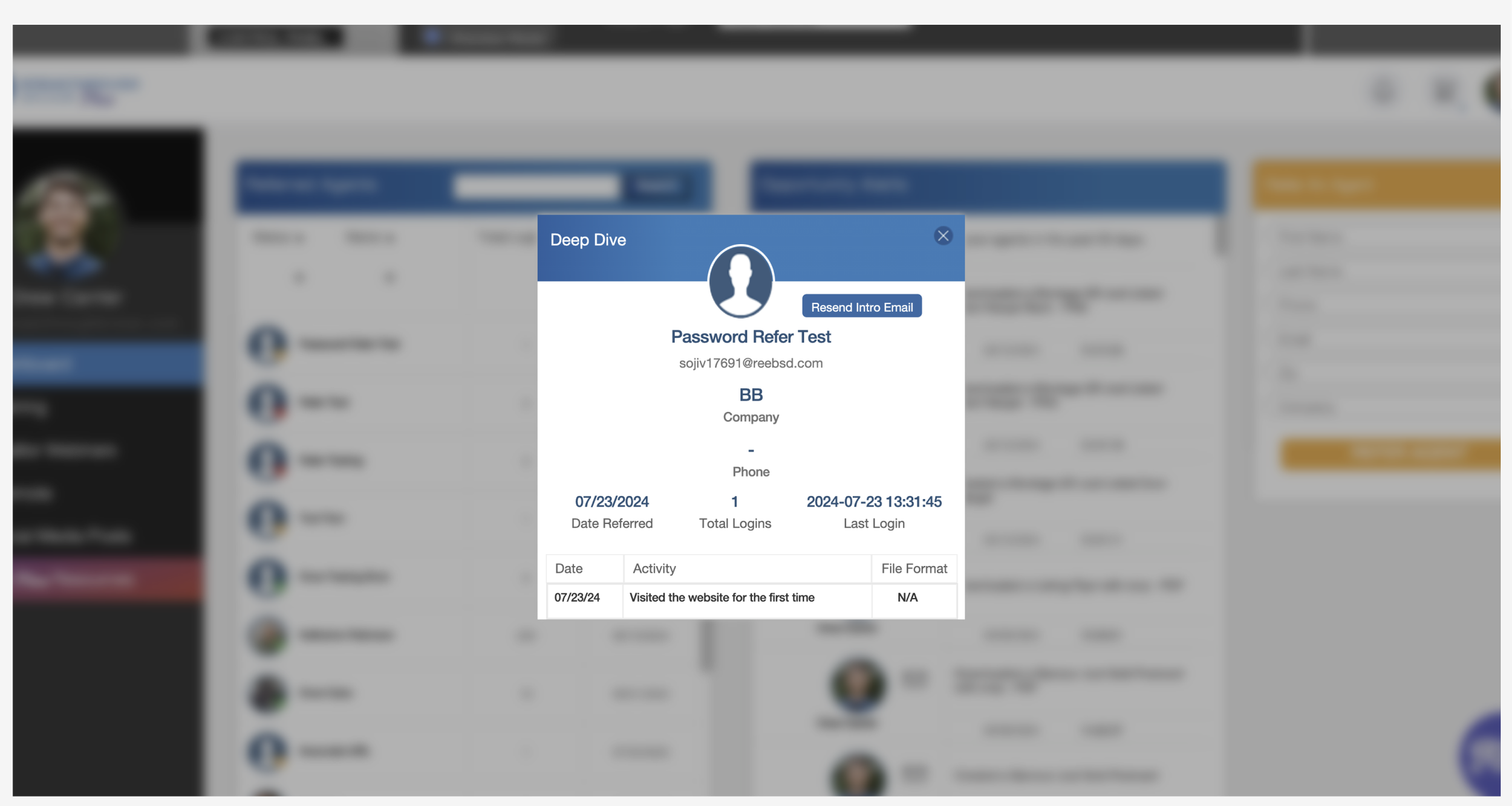
Previous Design: Deep Dive Modal
Prepping Files for Dev Handoff
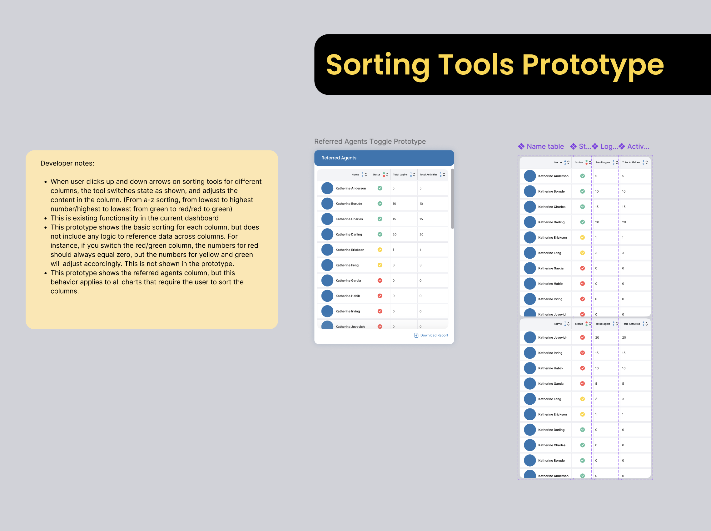
My responsibilities don’t end with high fidelity designs. Documentation for the development team is very important to producing a good end result with less time spent going back and forth in Jira and in QA. I ensured all of the different design flows were laid out in a logical order, with labels and development notes. I find that providing both in-file documentation and prototypes allows the dev team to gain the most insight into the intended designs, functionality, and animations.
Developer notes include written descriptions and visual aides.
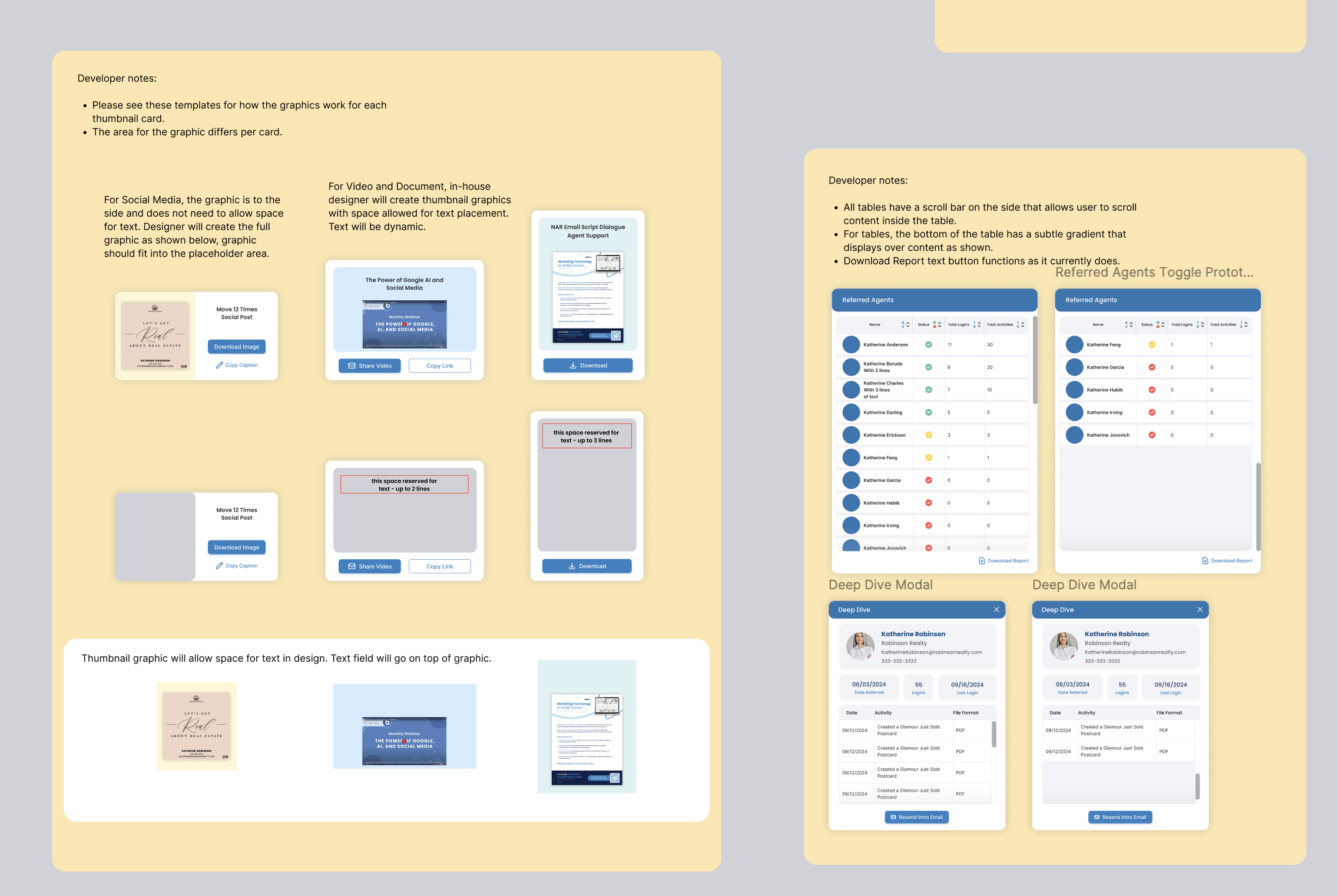
I also create additional prototypes to show specific element functionality.